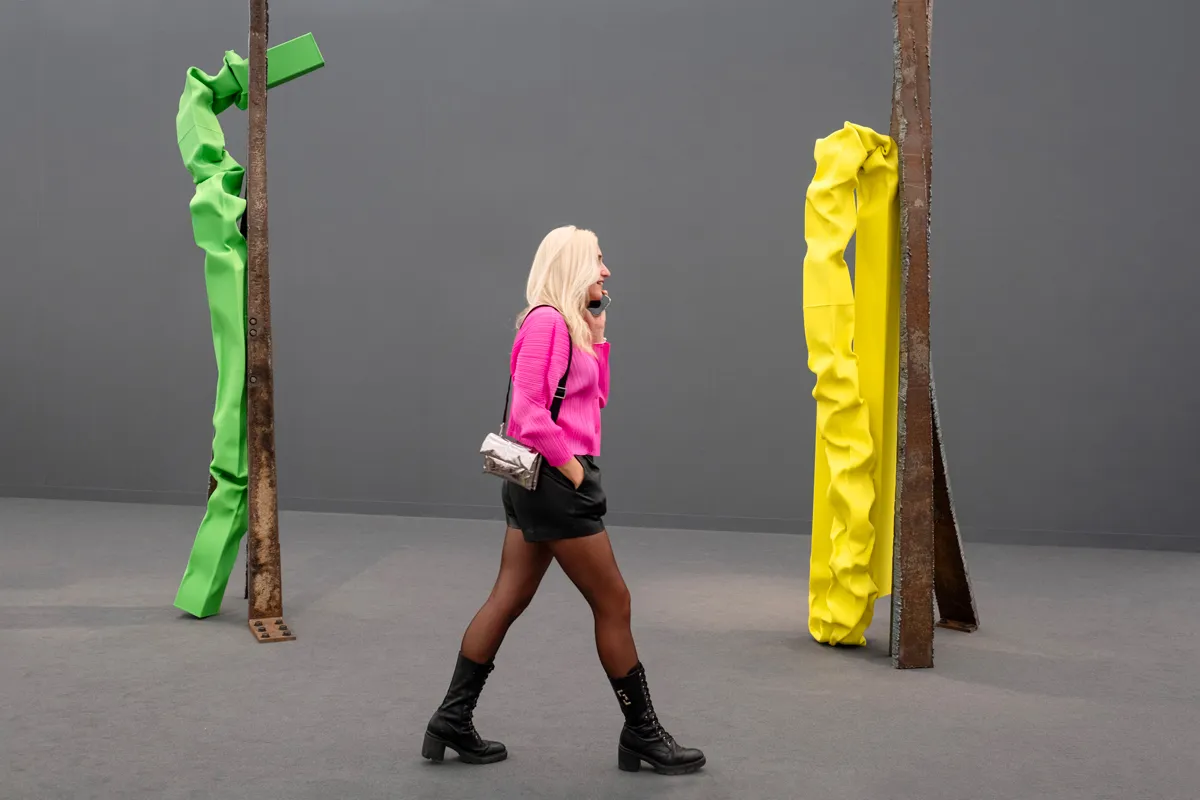
I often find it hard not to think of Halloween once October begins, when plastic pumpkins, spooky decorations, and cheap bags of candy start cropping up across the US. While Halloween doesn』t have quite the grip on the public imagination in the UK, at this year』s edition of Frieze London, which opened to VIPs yesterday, a comparison to the holiday』s signature trick or treating festivities didn』t seem like a stretch for the imagination, with groups of four or five stopping at one booth before quickly moving on the next, hoping that at least a few dealers have brought something worth sinking your teeth into.
Around town this week, there is still a lot of chatter over whether London can hold its own against Paris, where Art Basel』s French fair will open next week. After cursory introductions, everyone seems to be asking 「are you going to Paris?」 Anecdotally, many seem to be doing both. While the newly redesigned Frieze tent in Regent』s Park wasn』t exactly bulging at the seams, there was energy in the aisles. Only a handful of booths were ever empty for any significant time at any point during opening day, the few that were likely suffered from being placed in far corners of the tent.
More importantly, dealers did show up with wares that are worth spending time with. Below, a look at the booths most worth your time at Frieze London 2024, which runs through October 13.
-
Patron
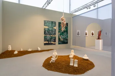
Image Credit: Gabriele Abbruzzese/Courtesy the artist and Patron As part of Frieze』s new layout, several medium-size galleries were placed toward the entrance and exit of the tent』s two main avenues, giving them the chance to catch visitors』 eyes as they made their way to see the megas of Hauser & Wirth, Pace, Gagosian, and Zwirner, which were tucked away in the tail end of the tent. Along the rearmost wall was 「Smoke」 a themed section organized by Hammer Museum curator Pablo José Ramírez that centered around ceramic works in dialogue with diasporic and Indigenous histories. The section itself is worth a visit.
Patron gallery』s solo presentation of Mexico City–based artist Noé Martinez stands out not just because of the power of his ceramics but also for how they are presented. Martinez』s art is mainly influenced by his Huastecan ancestors of eastern-central Mexico, their spiritual traditions, and their pottery. The figures themselves are modest in size, but have a potent, metaphysical weight to them. They are displayed on the floor, on mounds of sand, which, for the unabashed visitor, calls for crouching down and engaging with them in a slightly reverential way. The artist』s practice is meant to activate the spirits of his ancestors, according to the gallery』s associate director Luciano Medrano, who added, 「The past can only live if the present is making an attempt to animate it.」 -
Tiwani Contemporary
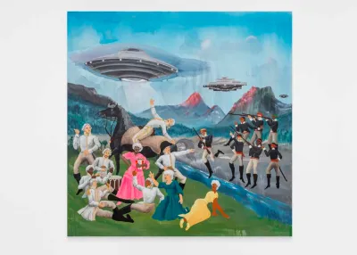
Image Credit: Courtesy the artist and Tiwani Contemporary The art world can take itself too seriously, often to the detriment of the people who could love art but are intimidated by the art world writ large. That』s not a problem for the artist Umar Rashid, who, according to Tiwani Contemporary』s Adelaide Bannerman, 「loves messing with historical narratives [by] retelling the story of empire and colonialism」 with his own cartoonish twist. His picture Terror in the Alps (2024) is a riot, both in a comedic sense and a violent one. Space invaders, soaring above the Swiss Alps, descend on what looks to be a colonial picnic luncheon. A translucent ray of light, assaults one fellow on horseback. Perhaps he and his powdered wig will soon be subjected to all manner of probing aboard the flying saucer. A young Black woman, wearing a pink dress and holding a bucket of Kentucky Fried Chicken, stands with relative calm in the center of this chaotic scene, while, in the background, soldiers in red sashes futilely aim their muskets at the alien ships. Good luck with that, guys. But the booth isn』t all laughs. Emma Prempeh』s From Sunset to Sunrise (2024) is a meditation on home and the memories of people in diaspora that adds a touch of seriousness and intimacy to a dynamic presentation.
-
Gagosian
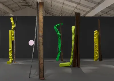
Image Credit: Maris Hutchinson/©Carol Bove/Courtesy Gagosian The grandiosity of Gagosian』s solo presentation of new large-scale works by Carol Bove is hard to put into words. It』s less a booth and more a statement. The tall, slender, vertically oriented sculptures stand ten feet tall in the middle of the tent』s final section. At least, it seems like the middle. The booth has no walls so the sculptures, as the artist intended, have room to breathe, a raw metal forest of sorts, punctuated by bright yellow tubes of crushed up stainless steel. It』s easy to gather around and even easier to catch a selfie, just about everyone within 15-feet of the booth was doing it. That much attention couldn』t have gone unnoticed by David Zwirner, whose booth (with proper walls and all) was directly across from Gagosian』s; last year, Bove left Zwirner for Gagosian after a 12-year relationship with the gallery. Whether that was on her mind, or the gallery』s, when Gagosian planned its Frieze presentation, who』s to say? But there』s no doubt the Gagosian』s not-a-booth has chutzpah.
-
Lehmann Maupin
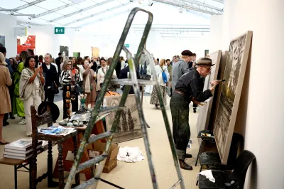
Image Credit: Henry Nicholls/AFP via Getty Images A quick brush stroke here, a little mark there. That』s what you』ll see at Lehmann Maupin』s booth, where British painter Billy Childish works on canvas after canvas. As he finishes one, two assistants prep others in this makeshift studio. To get a closer, some visitors stepped over Childish』s wooden ladder or leaned on his antique-looking, paint-covered work bench. 「Billy loves an audience,」 one of the gallery』s representatives told me, 「and he often works that way, very intuitively, very fast, it works with the pace of the fair. And someone』s already bought the painting he』s finishing now.」
It may have been just a bit showy, but isn』t that what an art fair is about? Grab attention and convert it into a sale. 「I read Picasso worked the same way, he』d just line up canvases and walk from one to another till they were all done,」 the rep added. The comparison is a stretch, but Childish and the Spanish master do have something in common, they both can whip up interest out of spectacle. -
Michael Werner
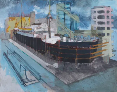
Image Credit: ©Hurvin Anderson/Courtesy Michael Werner Gallery There is a lot to admire at Michael Werner』s booth. A bright and punchy A.R. Penck from 1981, Zeichen der Realität – Realität der Zeichen (Sign of Reality – Reality of Signs), shows Penck』s trademark cryptographic symbols in bright red on top of sensuous scrapes and splotches of purple, both of which are heightened by the bright white background. There』s Issy Wood』s oil on velvet work, Caving (2024), a study in glossy texture.
But the real prize is an early work by Hurvin Anderson, SS Booker T. Washington (1996). It』s a deceptively simple painting of the eponymous World War II ship, surrounded by scaffolding as it sits in port. The echoes of a large city float in the misty background. But like the best works at the fair its narrative propels the picture onto another plane. The work is inspired by a Michael Andrews painting with a similar subject (Anderson is a big fan) but Andrews』s boat is swapped for one of the 17 US Navy warships commissioned during World War II that were christened with the names of influential African Americans, like Washington. It』s a worthy mediation on both aspects of Black history and the history of British painting.
-
Timothy Taylor
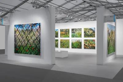
Image Credit: Photo Sebastiano Pellion di Persano/Courtesy Timothy Taylor The multicultural focus of this year』s Frieze London is arguably best synthesized in Timothy Taylor』s solo presentation of new works by Paul Anthony Smith. Smith is a Jamaica-born, New York–based artist whose contemporary landscape paintings don』t give away any sense of gender or identity. They are, however, narratively and visually rich once you start to pay attention. From a distance the work appear like flat, vistas of overgrown flowers and weeds at any overrun public garden in New York City. They are colorful, even beautiful, with an untamed quality inherent to neglected public spaces.
Upon close inspection, these canvases have their own mountains and valleys of texture made from Smith』s energetic swipes of oil stick. Often the flowers are covered by a slightly out of focus chain link fence, which is the case for many of the disregarded public parks in the New York. This reality also can be seen as a metaphor for the barriers and restrictions young Black people face in New York, especially when it comes to accessing spaces that are intended to be for the public. 「It』s a commentary of sorts on the American Dream,」 said Ross Thomas, a director at the gallery. 「There』s this very beautiful place that you』re always struggling to reach, but once you get there, you scrape away this beautiful veneer of oil stick, and you』re left with the dead and dry parking lot beneath it.」